I used iterative testing to build the case one small win at a time — A/B-tested campaign elements, engagement data, and student insight from focus groups. A quiet branding gap turned into a university-wide brand win, with measurable proof at every step.
That was the question prospective students kept asking. Rady School of Management is part of UC San Diego — but in quarterly meetings, admissions reported that every recruiting call started with clarifying which university Rady belonged to. Branding confusion was eating enrollment.
The fix wasn't subtle: full alignment with UC San Diego's brand system. But that required campus-wide approval, and the institution wasn't going to greenlight a logo change without proof.
So I built the proof.
I turned quarterly admissions feedback into a long-game strategy — iterating one round at a time, letting each metric earn the next decision until the rebrand had the proof it needed to land.
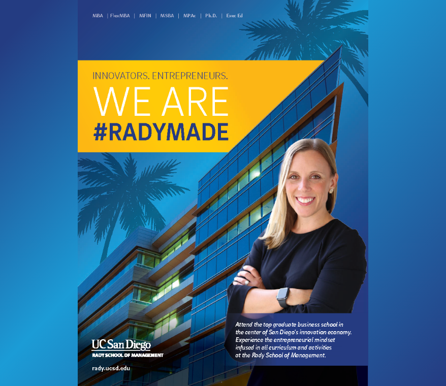
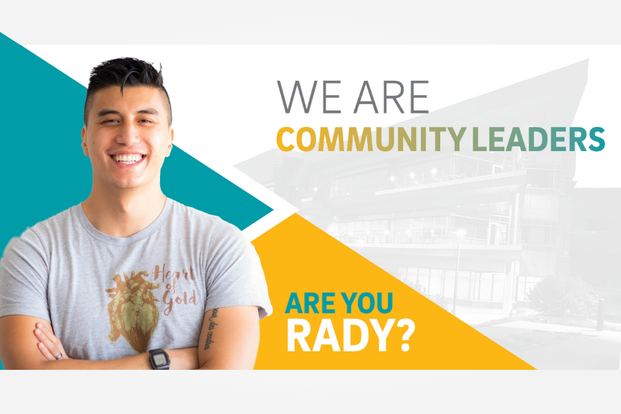
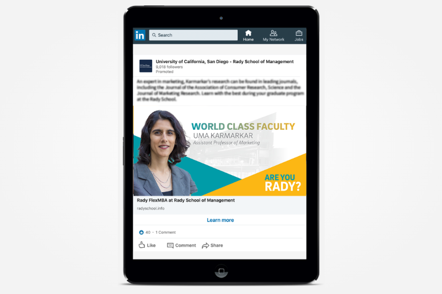
It was Q4 and the team was planning the next admissions campaign for the new year. We worked through the messaging concept together — and as the design came together, I started subtly weaving UC San Diego brand elements and fonts into the campaign, A/B testing them against the existing Rady design language.

The subtle integrations won. Fonts pulled from UC San Diego's system, color cues anchored in the University of California core palette of blue and gold. Supporting visuals reinforced the affiliation to both the Rady and UC San Diego brand. We had the direction — now we needed to see if it moved real numbers.
As the campaign rolled out across channels, the data came in clear. Targeted applications increased 9% against the prior campaign. The work was subtle — but that was the validation we needed to push this forward.
The 9% increase in applications helped validate the direction of the campaign. What it didn't tell us was why students chose Rady — or what was holding others back. Those answers came from listening.
Shortly after the campaign launched, quarterly meetings with admissions started — and the same patterns surfaced round after round.
Brand Confusion
Prospective students didn't realize Rady was part of UC San Diego.
The partnership hid so small on collateral
The phrase "University of California San Diego" sat at 2–4pt on most brochures and collateral, easy to miss entirely.
Those meetings were always illuminating, and always came with a strategy to refresh more materials, slowly incorporating more campus alignment.
Questions most answered by admissions included networking concerns and innovative curriculum to move their career path forward. The extended campaign did exactly that, spotlighting the faculty doing world-class work and the alumni proving the outcomes.
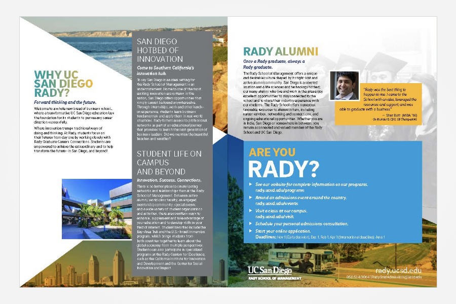
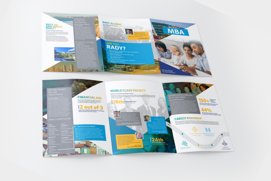
The next phase touched every step of the sales funnel — including refreshing admissions brochures across six program audiences. That complexity needed direct student input.
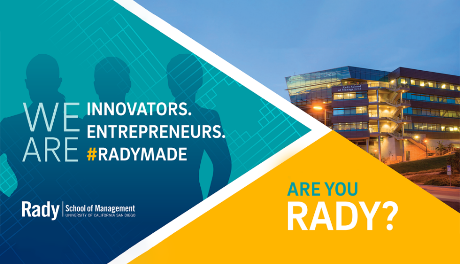
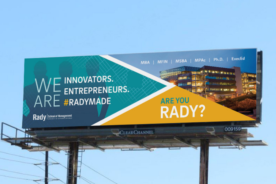
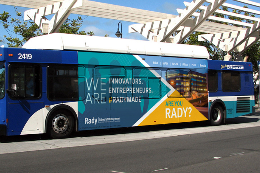
The takeaway shaped the sales funnel story. UC San Diego and the city became the core theme across all six programs — the partnership students said mattered most.
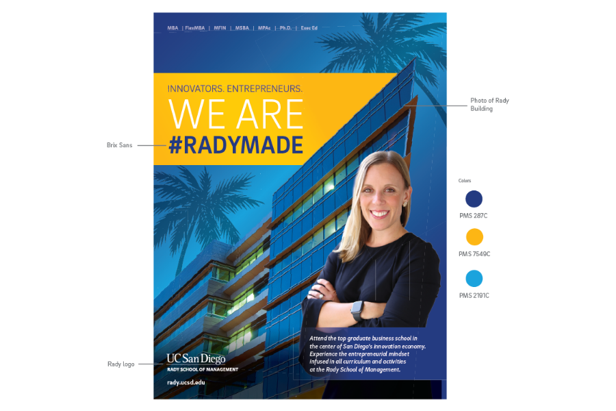
Every brochure across the six programs led with the same evergreen foundation — picturesque San Diego and UC San Diego as the institution standing behind it. From there, program-specific content responded to what students had told us actually drove their decisions: alumni networks and career placement.
"Brooke's designs brought the professionalism of the school together with the culture and vibrancy of San Diego."
With consistent feedback from admissions and data from every touchpoint — the refreshed sales funnel, email marketing metrics, and campaign engagement — it was time to build the case for campus approval.
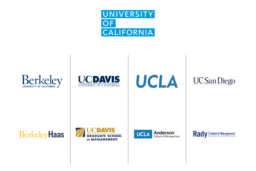
To navigate the approval process, I ran a logo audit comparing visual consistency across UC business schools — Berkeley, UCLA, UC Davis, and UC San Diego. The pattern was undeniable: every other school in the UC system led with the parent brand. Rady was the outlier.
The audit was the final piece. Paired with everything the team had already built — the refreshed sales funnel, email marketing metrics, and campaign engagement data — the Director of Marketing walked into campus with a case that was hard to argue with.
With the integration approved, I had two months to roll out a new brand across every Rady touchpoint. A logo change meant everything needed redoing — and doing it well meant building systems the team could carry forward.
Documentation built to outlast me.
A new brand only sticks if the team can run it without me there. I compiled brand resources and built task-specific documentation to keep the system intact across every program and channel. The goal was simple — if it's easy to use, people will use it.
A big project broken into manageable pieces.
I sequenced the rollout by impact — high-visibility and digital touchpoints first, then phasing in the rest by need. Batched print work kept the team motivated, and vendor negotiations kept the budget in check.
I've helped teams close funding, launch with confidence, and build brands that earn trust. If you're ready to move forward — or just need to talk through where to start — let's connect.