I led patient-centric UX research — then used every insight to design and launch a microsite ahead of schedule and under budget. The research didn't just support the work. It aligned the whole team around it.

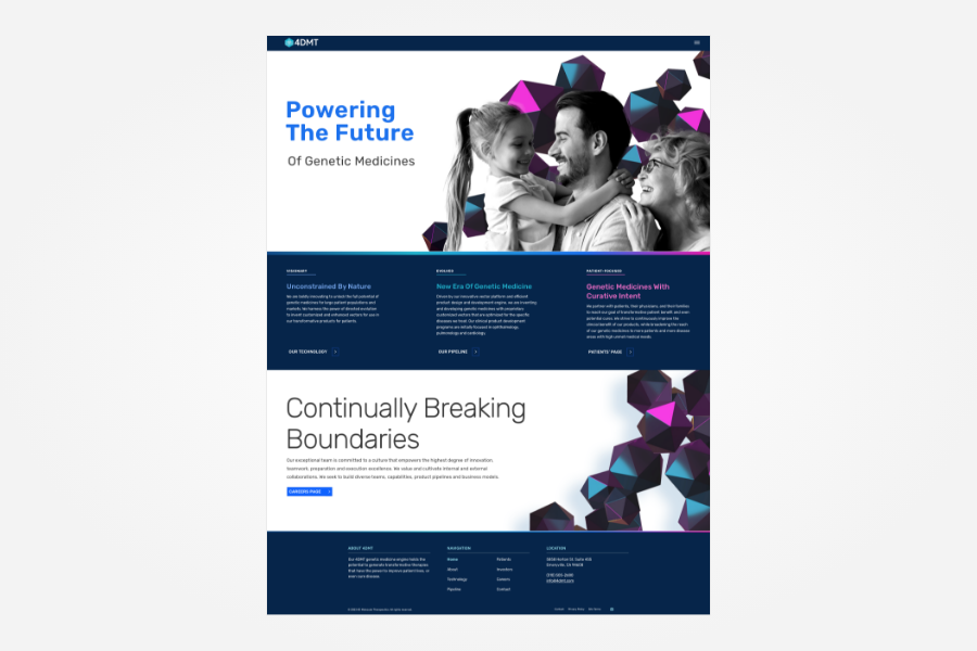
4DMT had just launched their brand and website — built for investors, clinicians, and their board. Then came the clinical trial campaigns, and with them a new audience that needed somewhere to land: patients and caregivers who'd never been part of the brief.
My job was to build for them.
Expert interviews, competitive audits, persona development, and full solo execution across visual design, accessibility strategy, and developer handoff.
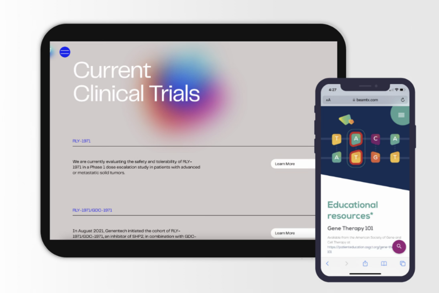
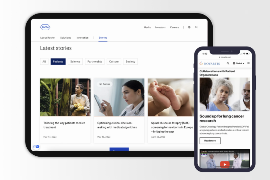
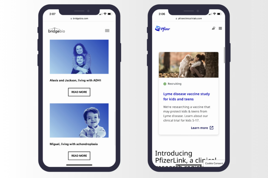
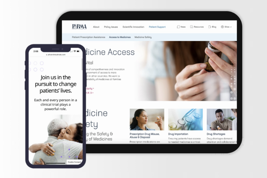
Finding similar-sized companies in pharma and biotech and auditing each site for similarities and differences. Photography, visual design, content tone, voice. Looking for patterns.
The competitive audit was great for information gathering, but the expert interview went deeper —told us why it mattered. A patient advocacy specialist walked me through what patients actually experience, and what builds trust, what breaks it.
When combining all the research efforts, there was one clear picture of what patients actually needed:
Not a number. Trust feels like a collaboration.
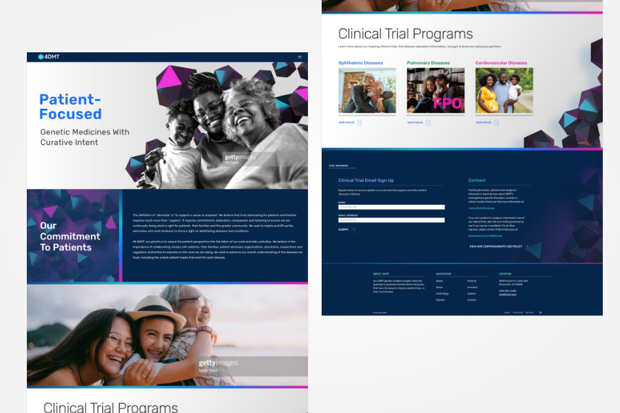
Photos showing providers and patients side by side. Headlines shifted to "our" instead of "your." Small choices that signal the we're in it with them.
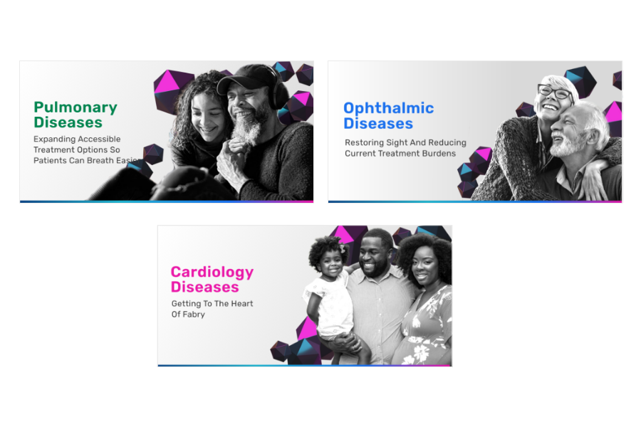
Real people, real audiences.
Capturing authentic moments. Every photo placement was intentional, not decorative. Generic imagery breaks trust before the page even loads.
Design helps visualize hope.
Visual language and content work together to signal hope. Soft tones, bold accents, emotive photography — every element pulling in the same direction.
These people are stressed, let's make it as easy as possible.
Streamlined navigation, clean visual design, and straightforward headlines — no jargon, no buried information. Clarity isn't a style choice. It's an accessibility decision.
4DMT needed a patient-facing microsite, fast. I'd built their original site — I knew the design system, I knew the team. The research told us what to make. The systems told us how to make it quickly.
The microsite didn't need to be built from scratch — it needed to be built smart. Using existing component library, making targeted adjustments.
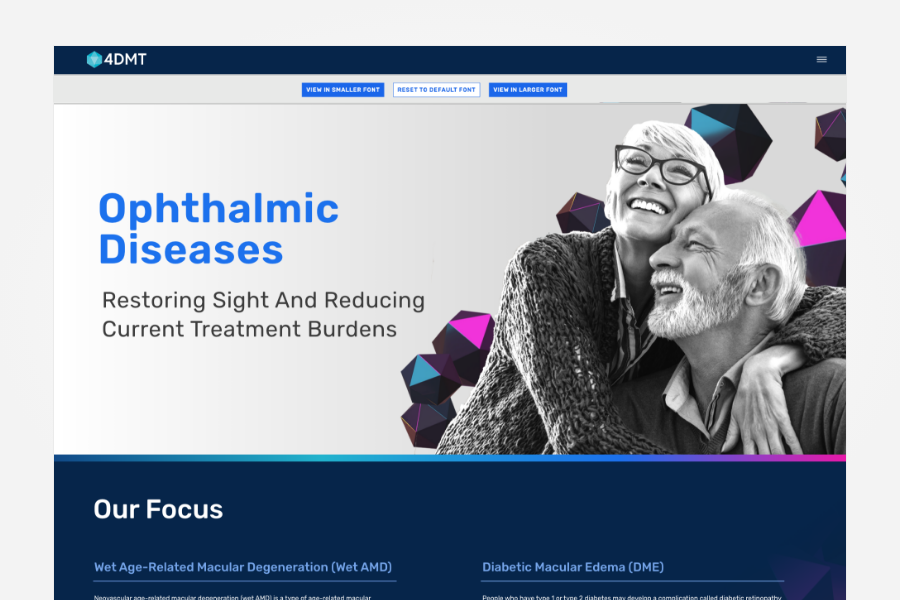
Ophthalmology patients don't look for buried accessibility options and don't want to self-identify as needing help. By proposing a larger default font and font-size toggle built directly into the page UI, patients never had to opt in.

Specificity builds trust, and generic stock photography was never an option. Although there wasn't a budget for custom photos, stock photography was ruthlessly criticized. Leading the photo selection process, working with 4DMT to define exactly who needed to be represented on each page.
"I really would have loved to work on full personas and usability audits on sites with you because we could do some amazing work"
The research didn't just benefit 4DMT. It changed how the agency approached every patient-facing project.
Knowing your audience before the brief does.
The patient/caregiver persona built for 4DMT became the foundation the team could pull before decisions were made. Less guesswork per project. Less scope creep per launch.
Build what the audience needs before they have to ask.
The 4DMT build set a new standard — start with the disease audience and design for their default state. Color contrast, font sizing, navigation clarity. Not features added at the end. Decisions made right from the start.
I've helped teams close funding, launch with confidence, and build brands that earn trust. If you're ready to move forward — or just need to talk through where to start — let's connect.