Evoke Canale needed to replace a PDF email chain with a digital meeting form. I read the scope, spotted a gap in the flow, and reframed the solution before the kickoff meeting ended.
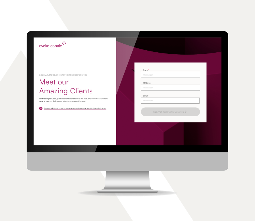
Evoke Canale needed to replace a multi-page PDF email chain with a digital meeting form for the JP Morgan Healthcare Conference. Reading through the scope, I saw a disconnect — the goal was to reduce friction, but the proposed flow was adding it.
I spotted the gap we needed to solve.
Solo designer. Kickoff through launch — flow strategy, wireframes, prototype, and dev support across a 4-week sprint.
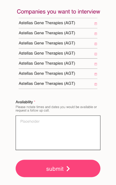
The original plan asked reporters to scroll through 39 clients, mentally note their picks, then recall them at the end of a separate contact form. For a user who's busy, moving fast, and fielding dozens of conference requests — that's not a digitized process. That's the same problem in a new format.
Bringing the gap into the room with the Project Manager, VP of Development, and Managing Director — the disconnect was clear once it was on the table. A new user flow was proposed and the team connected with it fast.
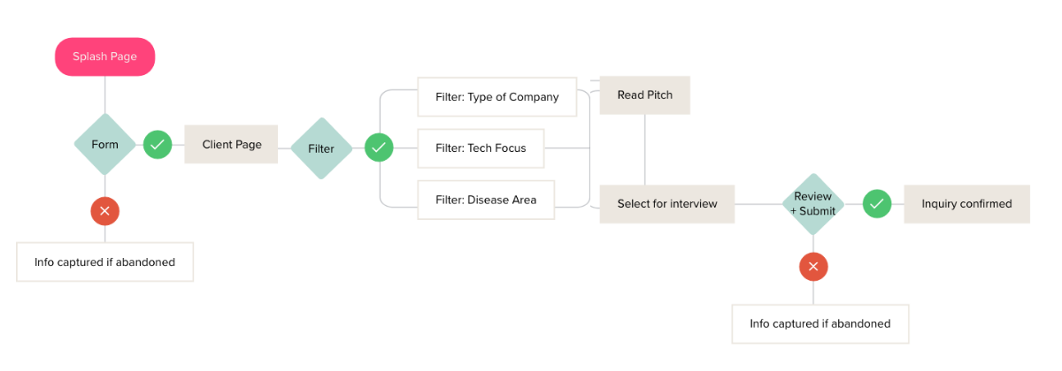
The new flow worked like an e-commerce checkout. Browse, select, confirm. Development team confirmed it was buildable. The Managing Director confirmed the data requirements. We left the meeting with a new direction.
The new approach reframed the whole experience. Instead of asking reporters to do the cognitive work, the flow did it for them.
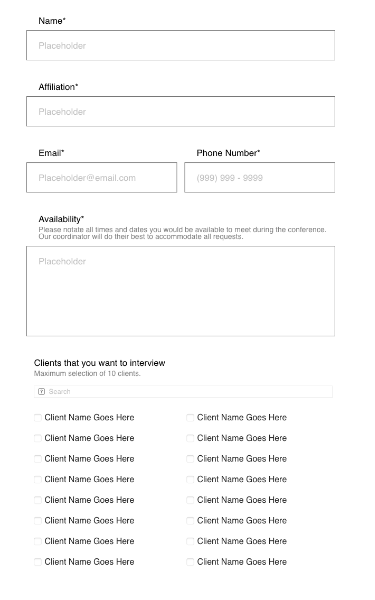
Contact info captured upfront
A password wall was already required. Capturing an email was a separate ask that ended up solving 2 issues, form abandonment and data privacy.
Add-to-cart reduces mental load.
Reporters browse, select, and submit a compiled list — no recalling, no backtracking. The backend receives a clean intake in lieu of a scattered email chain.
The privacy tradeoff worth making.
Password-protected forms are a known drop-off risk. Vetted press list, low risk, and emails captured upfront — a tradeoff the team was willing to make.
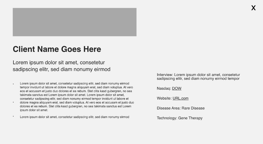
The strategic work was done. The job now was to execute it cleanly — using chosen templates, the existing brand system, and highlighting 39 unique client brands without overwhelming the design.
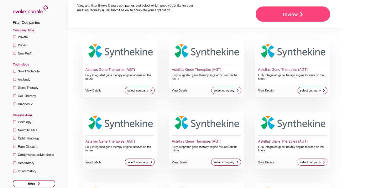
The VP of Development suggested a Masonry grid template during onboarding — no build from scratch, just a strong head start. That decision gave the design phase room to focus on what actually mattered.
Two component libraries merged into one — the Masonry grid template and the existing Evoke site. The result was a design that felt native to the brand without rebuilding anything from the ground up.
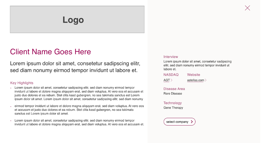
With 39 different logos tiling across the grid, a neutral template kept the page from feeling chaotic. Consistent spacing and clear visual hierarchy made it easy for reporters to scan, filter, and find what they needed fast.
"You take the time to help others understand projects better — and that design literacy helped me be a better partner, even from the communications side."
Collaboration, clear constraints, and a user-first flow meant the project ran clean from kickoff to launch.
Time saved on both ends of the project.
Starting with everyone in the room for the big decisions and closing with a formal prototype walkthrough meant less back-and-forth and fewer revisions before launch.
Knowing your audience before the brief does.
The press contact research didn't stay in this project. It became a reusable persona — available for future conference and event-related work across clients.
I've helped teams close funding, launch with confidence, and build brands that earn trust. If you're ready to move forward — or just need to talk through where to start — let's connect.